In short
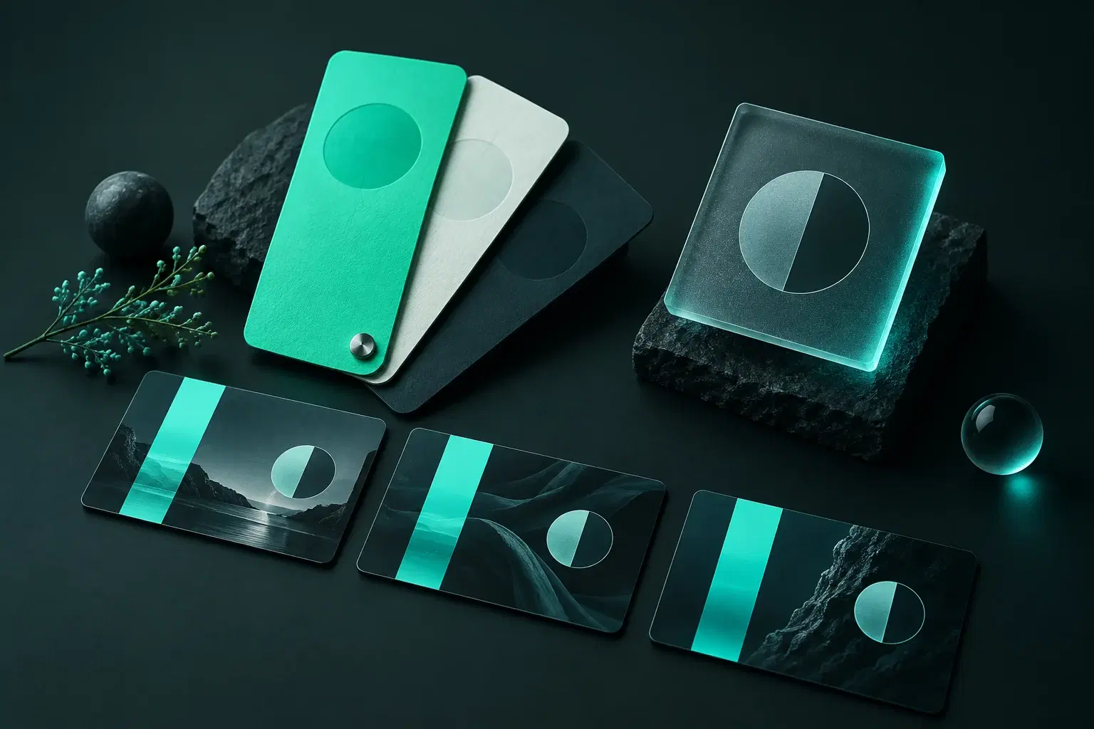
A brand kit for video is a saved set of the few things that make your videos recognisable: your colours as exact hex values, one typeface, and your logo. Its job is to take small decisions away. Without one, every new lower third or sale banner means choosing the blue again, and after thirty videos the channel has nine blues. In CaliberVisual a brand kit holds colours, a typeface and a logo, and applies to any of the 391 animations in one step, so a subscribe prompt made today matches the end card made in March. Paid plans save more than one kit: 3 on Pro, 10 on Studio, unlimited on Business.
How drift happens
Open the last ten videos from almost any small channel and pause on the graphics. The lower third in one is navy. In the next it is a slightly brighter navy, because it was picked by eye on a different day. The subscribe button came from a free pack and is red with a drop shadow. The end card uses a font the editor happened to have open.
None of those is a bad choice. Together they read as ten different channels. Viewers do not audit your hex values, but they do notice when something feels put together, and they notice faster when it does not.
What belongs in a kit
Less than you think. The kits that get used are short.
- Two or three colours, written as hex values. One main, one accent, one neutral for text.
- One typeface. Two if you have a real reason. A display face nobody can read at phone size is not a reason.
- One logo file with a transparent background, in the version that works on both light and dark footage.
Check the colours before you commit
A palette that looks good on a brand board can fail on video. Pale yellow text over footage disappears. Thin grey type on a mid-grey plate is a smudge on a phone in daylight.
Run your text and background pair through a contrast checker before it goes into the kit. If it fails there it will fail harder once a platform compresses it.
One step, not thirty
The point of saving a kit is that applying it costs nothing. Open any animation, choose the kit, and the colours, the typeface and the logo land in the right slots. The motion stays as it was authored. You change the words and export.
For an editor or an agency this is where the hours go. A kit per client means the Tuesday job for the dentist and the Wednesday job for the gym never borrow each other's green.
Where a kit stops
A kit keeps graphics consistent. It does not grade your footage, write your hook or fix your audio, and a channel with perfect lower thirds and bad sound is still a channel with bad sound. Treat it as the floor, not the strategy.
Questions
What is a brand kit for video?
A saved set of your colours, typeface and logo that is applied to motion graphics in one step, so every title, prompt and end card matches without being restyled by hand.
How many colours should a brand kit have?
Two or three. One main colour, one accent and a neutral for text. More than that and every video becomes a choice again, which is the thing the kit exists to remove.
How many brand kits does CaliberVisual save?
The free plan saves 1. Paid plans save more: 3 on Pro, 10 on Studio, unlimited on Business.
Can one account hold kits for several clients?
Yes. Each kit is separate, and any animation can be switched from one kit to another. Studio is the plan built for several brands on one seat.